Thursday, December 22, 2011

Review: Black N Red Day Per Page Diary (2012)

One of the habits I've tried to sustain this year is writing *something* about my day, each day.  A diary (as in a proper diary sometimes called a daily planner, with printed dates on each page) makes this a bit easier for me - an unprinted book would doubtless lead me into the most terrible backsliding.

So far, I've used Moleskine Daily Planners (2009, 2010, pocket size - they've been surprisingly ok, given how poor the paper is in their notebooks, but are expensive) and a Ciak Daily Planner (2011).  The Ciak was a bit disappointing, with thin paper that had a lot of show & bleedthrough through for some inks.

For 2012, I bought a Black N Red Day to Page diary in the A5 size.  UK readers with decent stationery cupboards will be familiar with Black N Red, who make a series of spiral bound and casebound notebooks that are generally well regarded.  The diaries use a 90gsm "Optik" paper, and come in a range of sizes up to A4 (which seems to me to be massive - even I would struggle to fill an A4 page with my pointless wibbling each day).

Bardtp_frontcover025
The front cover - I think the "Oxford" logo is new, I can't remember seeing it on Black N Red products before.

Bardtp_frontcover026
The rear cover is rather busier, with product information, barcode, and so on.

The diary is casebound, with stitched signatures, and the cover is a nicely textured cloth over board.  The contrasting spine appears taped, although it isn't. A red woven ribbon is glued into the binding for use as a place marker.  All of the pages (save the end papers) have perforated corners, which you can remove to allow quick location of the current day (assuming you remove the corners after each day, of course).

Bardtp_page024
A Sample Page

The diary begins with a page for contact details, followed by a two page year planner for 2012.  After the planner, it's straight into the daily pages, an example of which is above. Note that Black N Red don't put Saturday and Sunday on one page, which some daily planners do to save space. At the end of the diary (the last dated page is 3rd January 2013) is another two page year planner (for 2013), a page of country information, a page of weights and measures and mileages, a page of international telephone codes and time zones and then 6 pages for notes.  It's fairly restrained in this respect, (no tube map, for example) and I quite like that, having never really appreciated the pages and pages of junk I never use that crops up at the beginning and end of some dairies.

The main diary pages have three months of calendar on the top left hand side, showing the previous month, current month and coming month.  The main part of the page has appointment times from 07:00 to 20:00, split into half hours.  Below this are "Quick Note" spaces.  (I should say that I don't use these planning features, I just write on the pages, so can't really comment on how useful it is).  Lines are dark ruled, at a fairly narrow 5mm spacing - the paper is a bright white that ink shows up very nicely on. 

The amount of writing space is slightly larger than my medium Ciak planner (much larger if one writes beyond the lines and into the notes spaces on the Black N Red pages), despite the Black N Red being a larger book.  This is because of the rather busier page layout in the Black N Red diary - I don't think it's fair to criticise that, because the product is, I think, intended to be a planner rather than a journal or personal diary.

I bought my diary from Ryman, for £9.99, although they're fairly widely available, and the price doesn't seem to vary much between stockists.

Note that I've done my ink tests on the "Notes" pages at the back of the diary - I'm assuming the paper quality is consistent throughout.

INK TESTS

Bardtp_show023
Showthrough (how visible your writing is with a blank page over it).

On showthrough, I think the diary is slightly less impressive than this scan shows - not terrible, but there is some ghosting through the facing page.

Bardtp_bleed022
Bleedthrough (how much of the writing is visible on the reverse of the written page).

It's a similar story on bleedthrough, although the scan gives a fairer (possibly *slightly* unfair) picture here.  There's a small amount of ghosting, with the beginnings of bleedthrough at a couple of points from Amazing Amethyst and Pousserie De Lune ink.

Bardtp_ink021
The written page.

Bardtp_ink021_closeup1
Close ups - the lower set of inks.

Bardtp_ink021_closeup2
And the top set.

I think the ink tests tell the best story of this paper though - compare inks like Amazing Amethyst, Pousserie De Lune and Havana Brown with their performance in previous reviews, and the superiority of Black N Red's paper is evident.  I can't make out any feathering, even from problem inks in close ups, and for that, I'll put up with the small amount of ghosting on facing and reverse pages.

IN SUMMARY

For the page count, and the cost, I think the Black N Red diary is a great buy - the paper is better than any day per page diary I've used, and it costs less than a lot of premium daily planners/diaries.  If you can live with the slightly utilitarian styling (these books always remind me of being at work, but that could just be an association I have), busy page layout, and lack of premium notebook fripperies (soft cover, rounded corners, elastic closure &c) you'll not regret getting one.

Posted via email from monkeyphoto's posterous

Thursday, December 8, 2011

Notebook Review - Staples Eco Notebook, A5

Bagasse_cover2

The Staples "Eco Easy" notebook is a spiral bound notebook, with 160 ruled pages (80 sheets), and board covers. Its pages are Bagasse paper, made from 80% recycled sugar cane processing waste, hence the "Eco" title. I bought mine in their Manchester store, for the rrp of £2.49. The cover you see in the picture above is a brown paper foldover cover, that can be removed to reveal a plainer board cover.

For those of you worried about the variability of the paper in these (mentioned in some other reviews) the product code on this notebook is #37537-EU

Bagasse_cover
The front of the book, with a Moleskine pocket notebook on it for scale.

Inside the front cover is a "pocket page" formed from a heavier brown paper page, folded back on itself with a third or so of the lower portion folded up to make a crude pocket. It's not something I'd use, personally, but I rarely use the pockets in other notebooks, so may not be the best judge of the utility of this feature!

The sheets are perforated, and double punched to allow them to be removed and stored in ring binders.

Bagasse_mole2
The binding, again with a Moleskine pocket notebook for scale.

The spiral binding is done with what seems to me to be a pretty big coil - my personal feeling is that this makes the book a bit of a pain to carry around, although the pages do turn easily compared to books with more compact spirals (Pukka Pads, for example). The spiral doesn't seem to interfere with writing on the page, so long as you write to the long side of the perforation and margin; you may find it more problematic if you like to use the entire page. The beefiness of the coil does give me some confidence that it wouldn't be damaged by relatively rough treatment - you could throw this pad in the bottom of a bag, and be reasonably confident you could still turn the pages after the rest of your posessions had tried to squash the spiral!

The paper is an orangey sort of cream colour to my eye, and the ruling is a complimentary orangey brown, spaced at 8mm. A margin is ruled on the left of the page, at 14.5 mm from the perforation, and 29mm from the bound side's edge of the page. My feeling is that paper has more "tooth" (the "scratchy" feeling as a nib moves over the page) than the paper in my Rhodia bloc pads, but not to an unpleasant degree.

INK TESTS:

Bagasse_ink015
The paper handles most inks pretty well - there's some feathering from Waterman's Havana Brown, and Diamine Amazing Amethyst, which I'd expect, after tests of these inks on other papers. I detect a small amount of feathering from Quink Black, but only if I look at closeups.

I think the only inks with "unzoomed" noticeable feathering are Diamine Dark Brown, and J. Herbin's Pousserie de Lune - even that doesn't seem too bad compared to their behaviour on the Moleskine & Ryman books I tested previously.

Some closeups;

Bagasse_ink015_closeup1

and the top set;

Bagasse_ink015_closeup2
Note that the lowest green ink is "Diamine Emerald", not "Emerale". That's what you get for writing ink test pages too late in the day, I guess.

Bagasse_show014
The paper feels pretty thin, and that's borne out by the showthrough scan above (how visible the ink is when covered by a single sheet of blank paper).

Bagasse_show014
The reverse of the pages show up the thin paper too, with the inks clearly legible from the reverse side of the page. This is a more controlled, less blotchy reverse page than I saw on either the Ryman or Moleskine though, and I think overall, that's better.

IN SUMMARY

If you like spiral bound pads, this is a good bet at a relatively cheap price, if you can live with a somewhat over engineered coil in the binding, and the relatively thin paper. Do bear in mind that the paper in these pads has been known to vary in quality - the usual advice is to check the product code, and country of origin, and buy pads from the same batch, if you like your sample!

Posted via email from monkeyphoto's posterous

Friday, November 25, 2011

IRD Cafam Cantilevers

20112011034
Latest addition to the LHT is these IRD "Cafam" cantilevers.

I'm hoping for more power than the CR720 brakes, with less grabbiness than the Tektro Oryx. (It's surprisingly hard to find a cantilever that will play nicely with STi road levers).  One happy coincidence of the geometry of these brakes is more room at the fork crown (the CR720 need the straddle to be down on the mudguard) - hopefully that'll be where my dynamo light goes once my dynohub wheel is built.

First indications are pretty positive - I've run the brakes for a week now, although I've not done a wet ride with them, which is probably the real test they need.

Huge thanks to James at Fine-ADC for getting me these - they're surprisingly hard to lay hands on locally, so I was glad I was able to buy direct from Fine.

Posted via email from monkeyphoto's posterous

Thursday, November 24, 2011

Red Harvest

Redharvest013
First published in 1929, "Red Harvest" is my favourite Dashiell Hammett novel.  Cleverer people than I talk about it, and its influence in its wikipedia page.

I remember this cover as slightly more striking than it is here (and it's not a patch on the beautiful Knopf first edition) but I like its simplicity.

Posted via email from monkeyphoto's posterous

Saturday, November 12, 2011

Colour Comparison - Diamine Teal vs Diamine Blue Black

Blueblack_teal004
It's hard to see the green in the Teal colour when it's not set against another ink - here's a close up;

Blue_black_teal_lrg
Paper is Bloc Rhodia (from a No.11 pad), pens are both Schneider Base.

Posted via email from monkeyphoto's posterous

Monday, November 7, 2011

Ryman Softcover Notebook (Pocket) vs Pocket Moleskine

Ryman are a UK stationers, with both High Street stores, and an internet shopping presence. The notebook featured here is also available in an A5 size, which costs £5.99 (and is included in the current 2 for 1 offer, making the A5 book effectively £3).

Ryman's pocket notebook (as tested here) currently costs £4.99 (although with their buy one get one free they are effectively £2.50 each). A pocket Moleskine costs between £6 (Amazon) and £10.

Both pocket and A5 books come in Purple, Red, Brown and Black covers, each having 192 sheets of cream paper.

06112011029
Side by side - hopefully you can see that the Ryman notebook (right) is just slightly larger. The Moleskine here is a hardcover, although comparison with my softcover Moleskine planners suggest that the Ryman cover is somewhat stiffer.

06112011028
Both books have 192 pages (96 sheets). As you can see, the Ryman book is slightly thicker, indicating a heavier weight of paper. This is borne out by the feel of the pages - the pages in the Ryman are smoother, and do seem thicker. The ruling is darker than in the Moleskine, and spaced at 6mm.

06112011030
The rear is stamped with Ryman's logotype. Neither this, nor the smooth cover look quite as nice as the Moleskine logotype & cover. The Ryman book has an elastic closure, a woven ribbon as a placemarker, and a pocket at the rear cover, just like any notebook of this type. (The brown is actually darker than it appears here).

Rymanvsmole001_ink

Ink Tests

In all images, the top page is from the Ryman book, the lower from the Moleskine.

Rymanvsmole003_bleed
Bleed through test - the reverse of the pages after being written on.

Rymanvsmole002_show
Show through test - how visible the writing is when underneath a blank page.

The Ryman beats the Mole on showthrough (can you see writing through the facing page) and is slightly better (I think) on bleedthrough (can you see what you've written when you look at the back of the written page) although neither is great in that respect.

The Ryman loses on feathering for some inks (Waterman Havana Brown, Diamine Amazing Amethyst, and J. Herbin's Pousserie De Lune), although the Mole feathers more consistently (weird, tendril like growths from the letters, as though the ink is following the paper fibres). The Moleskine is definitely better at handling J. Herbin's Pousserie de Lune than the Ryman book.

Some closeups - Ink in the Ryman;

Rman_closeup1
And the same inks in the Moleskine;

Mole_closeup1
The top set from the Ryman;

Ryman_closeup2
and the Moleskine;

Mole_closeup2
Neither book is a patch on Ciak, Rhodia or Quo Vadis products, which have far better paper - and to be fair, neither Ryman nor Moleskine position themselves as "fountain pen friendly" notebooks. However, the Ryman notebook, despite being cheaper, performs better than the pocket Moleskine for all but a couple of the inks I tested. The Moleskine is worse for show and bleedthrough than the Ryman product.

Posted via email from monkeyphoto's posterous

Thursday, October 13, 2011

A Carradice Bodge

The seat tube angle on the LHT is fairly slack, and I've never really liked the way the Carradice hung from the bag loops on my saddle because of it.  Last week, I finally got around to doing something about it.

04102011011
I cut a short length of pvc pipe, wide enough to feed the seatpost strap through.

Then, I cut a longer piece from a 26 x 2.00 innertube - this went through the pipe, with the ends folded back over the outside, and taped down with electrical tape.  The tube should, I hope, stop the pipe abrading the bag.

The whole lot goes over the seatpost strap, and stands the bag a little way away from the post.

With something reasonably firm packed against the seatpost end of the bag (a book, for example), the bag now hangs at a far better angle. As a bonus, I finally feel like a proper Carradice owner, having used a few pennies worth of leftover DIY stuff to fettle the bag.


Posted via email from monkeyphoto's posterous

Friday, September 23, 2011

Speaking of Hub Gears...

Vernon Forbes' "Elegy For Sturmey Archer".

http://www.hadland.me.uk/elegy.htm

(Doesn't include the period after their closure, btw).


And Mr C.'s AW hub service, at his Manchester Cycling site;

http://manchestercycling.blogspot.com/2011/04/repairing-aw-hub.html

Posted via email from monkeyphoto's posterous

Wednesday, July 20, 2011

SBS Cycling Central Feed - A Quick Review

I posted this in my updated podcast listing, and thought I should talk a little more about it.  I'd intended to do a proper review, but realised that the Tour would end before I wrote that, so I'm dashing this off instead.

Essentially this is a feed with three podcasts on it - there are regular stage updates, about three minutes long that just recap the result and GC.  There's also the Sag Wagon, a daily 30 minute show, and interviews (usually conducted by Anthony Tan).

The Sag Wagon is the one I wasn't sure about in my podcast listing.  It is an odd format, most of the talking is done by host Sam Pang, a journalist whose background is football, olympian Dave Culbert (who I'd assumed was a cycling olympian, but was actually a long jumper),  and a cycling journalist, Sophie Smith, who is deferred to when results, stats &c are needed. 

I have to say, I'm warming to the Sag Wagon - it is flippant, but it's more good natured than my first impressions of it suggested, and I like the interplay between the hosts.  Is it the place to go for incisive post race analysis? Probably not, but it's good fun, and I'm now looking forward to their intermittent features (Chateau of the Day, the Battle for the Lanton Rouge, Where Did Tony Martin finish today, and so on...).

If you're of a serious frame of mind, the interviews will make this feed well worth adding to your podcasts.  You might remember Anthony Tan as a somewhat, er, disruptive presence on last year's Cycling News tour podcasts.  He's far better in charge of the microphone, I think, and worthy of particular note are his interviews with Colombian journalist Luis Barbosa, author and journalist Richard Moore, and Cycling News' Dan Benson.

In short, I think my first impressions of SBS' Cycling Central podcast offerings were wrong - add the feed and see what you think.

Posted via email from monkeyphoto's posterous

Thursday, July 14, 2011

The Monkey RSS Folder - An Update

This is an update of a post I made a little while ago - if you read that, my new podcasts are marked *NEW* (well, duh).  I'd particularly commend the Flammecast (cycling) and Pappy's Flatshare Slamdown (comedy) to you.  The Pod Delusion's "Extra" feed is full of gems (Natalie Haynes' talk at the BHA conference, Mark Stevenson's "Optimists Tour of the Future") if you like science, skepticism &c.


Been meaning to do this for a while, but this is a list of the stuff I *try* to catch each episode, or stuff I've enjoyed that's on hiatus but worth subscribing to either for the back catalogue, or a possible new series. 

The categories are a bit arbitrary (The Amateur Scientist would fit in Science and Skepticsm too, and Collings and Herrin might possibly fit in news) but do represent what I listen to them for.

Mostly.

Most of the links below go to title pages rather than the RSS itself - I thought this better, as a description for each 'cast would make this a very long post.  I subscribe via RSS - I think most of the 'casts have an iTunes feed too, but I can't say for sure as I don't use iTunes.

All the feeds are free, and some have a "tip jar" system for you to donate to the creators if you like the content - others have subscriptions, and some will encourage you to pick up the authors' work or merchandise in other, paid media if you like what they're doing.

Comedy

The Adam and Joe Show

Adam's Big Mixtape

Comedy of the Week (Radio 4) *NEW*

Collins and Herring (6 Music Show)

Friday Night Comedy (Radio 4)

Jon Holmes

Mike Detective (spoof of Pulp Private Eye Stories) *NEW*

Newsjack

No Pressure to Be Funny (NSFW - some bad language) *NEW*

One Life Left

Onion Radio News

Pappy's Flatshare Slamdown (NSFW - bad language, and depending on who's on it, adult themes) *NEW*

Richard Herring's As It Occurs To Me (NSFW - lots of bad language & adult themes)

The Amateur Scientist (NSFW - occasional bad language & adult themes)

The Collings and Herrin Podcast (NSFW - lots of bad language & adult themes)

What Are You Laughing At? (the British Comedy Guide's new podcast about comedy) *NEW*

What's So Funny? (Another one about comedy, this time from Radio 4 Extra - presented by Rufus Hound) *NEW*

You Look Nice Today (NSFW - occasional bad language & adult themes)


Cycling

Bike to Work Book Podcast

Carrément Vélo (in French)

Cycling Central (Not sure if this one will survive to the next update - like the ITV one, it's a national broadcaster's cast, but unlike the ITV one, seems to assume that people who don't follow cycling will find it all a bit silly - I may just not be getting the humour) *NEW*

Flammecast (occasional bad language) *NEW*

ITV Tour De France Podcast

NY Velocity

Real Peloton

The Bikescape Podcast

The Bike Show

The Cyclingnews.com Podcast

The Spokesmen

The Velocast

Veloclub Don Logan


Cricket

Test Match Special


Environmental

Costing the Earth

NPR: Environment Podcast

TreeHugger Radio


Other Factual (Documentaries, History &c)

A Point of View

Documentary of the Week *NEW*

In Our Time

Philosophy Bites

Radio 4 Choice

Thinking Allowed


Languages

Laura Speaks Dutch

The French Podclass


Music & Film

Bleep

Desert Island Discs

dublab

JJ's Smoking Sessions

Little White Earbuds

Kermode & Mayo's Film Review

NinjaTune Ninjacast

Three From Leith

Whomix Radio

XLR8R


News & Current Affairs

Global News (Round up of the news of the day from the BBC World Service)

Analysis

File on Four

Broadcasting House

From Our Own Correspondent

iPM

More or Less: Behind the Statistics


Science and Skepticsm

Little Atoms

Material World

Monster Talk *NEW*

Nature Podcast

Righteous Indignation

Science in Action

Skepticality

Skeptoid *NEW*

Strange Quarks

The Infinite Monkey Cage

The Pod Delusion

The Pod Delusion Extra *NEW*

The Skeptics' Guide To the Universe 5x5

The Skeptics' Guide To the Universe


Short Stories and Fiction

Cast Macabre (Short form horror)

Clarkesworld (Short form science fiction)

CrimeWAV (Short form crime and noir on the hardboiled edge of the genre)

Cthulu Podcast *NEW*

Escape Pod (Short science fiction)

Machine of Death (Short Stories about a world in which death (manner, not time) can be predicted. Some really interesting ideas from the different authors) *NEW*

Patrick E. Mclean (Short articles, longer form fiction) *NEW*

Podcastle (Short form fantasy)

Pseudopod (Short form horror)

Scott Sigler Audiobooks (Novel length serialised horror and science fiction, and Scott's reader feedback and interviews elsewhere. Definitely not for kids.  The current serial is "Ancestor", but Scott's back catalogue is available too, including fan favourites like "Contagious" and "Earthcore")

Shadow Publications (Author Paul Elard Cooley's Feed - short and long form horror fiction) *NEW*

Toothless (Novel length serialised horror - an interesting twist on the zombie genre so far - not for kids).

Underwood and Flinch (Mike Bennett's novel length serial tale of a vampire and his reluctant servant in modern day Spain - again, not for kids)

(Also worthy of mention is the MIGHTY podiobooks.com, which has more serialised audio fiction than you can shake several sticks at, and an excellent personalised subscription system).

It's worth noting that the biases of the Internet mean that much of this is horror, fantasy and science fiction - and lots of it is written specifically to be somewhat disturbing (it's horror, after all!).  As I recall, Clarkesworld, Escape Pod & Podcastle will give a guidance rating with stories, so should be safe for those of a nervous disposition (as long as you pay attention to it).

Technology

All About Symbian

Gamecast *NEW*

NPR: Technology Podcast

Outriders

Posted via email from monkeyphoto's posterous

Monday, June 13, 2011

Velo Orange: Grand Cru Touring Hub are Here

Media_http2bpblogspot_bqcil

Aside from being quite lovely things, these aesthetically pleasing hubs are beautifully designed.

Watch the video at Velo Orange's post on field servicing these - clever stuff indeed.

Posted via email from monkeyphoto's posterous

Thursday, May 26, 2011

Just Me Then...?

Graph003
A thing what i have proved with SCIENCE. And a graph.

Posted via email from monkeyphoto's posterous

Sketch: Counter Knowledge

Graph004
An attempt at copying the cover of Damian Thompson's "Counter Knowledge", in the hope of learning to draw what I see, rather than what I *think* I see.  Also without pencils, to commit to the line completely.  Not very good, but not completely terrible.


Media: Moleskine Pocket Reporter, Rotring Esprit with Diamine Monaco Red, Schneider Base with Diamine Imperial Purple.

Posted via email from monkeyphoto's posterous

Thursday, May 12, 2011

From Podium Café: The Big White Elephant in the Room - the Portrayal of Sportswomen in the Media

Media_httpassetssbnat_rdgwz

An interesting piece by "miffyg" on Podium Café.

I have to admit to feeling uneasy about the "Cycle Passion" style of promotion - something that seems to have filtered into cycling from the world of FHM et al, one where the "raunchy" photoshoot is almost a prerequisite for celebrity. I have cycling calendars, and generally they depict races, victories and iconic moments from the sport's history. They don't show riders larking about in their pants.

So why is women's cycling different?

To take a couple of examples, this shot of Lizzie Armistead winning at the Tour of Chongming Island;
http://www.cyclingnews.com/races/tour-of-chongming-island-2-1-we/chongming-ne...

Or this pic of Hannah Barnes;

Would be the equivalent of what we see when male racers are depicted - and for me, they're a better portrayal of the riders and the sport.

(Yes, I know about Pippo's Sidi ad - I'd argue that's the exception, not the rule).

Miffyg's shoot is still somewhat artificial (wrenching in your race kit?) but kudos to her for steering away from the "cheesecake" style she was uncomfortable with.

Posted via email from monkeyphoto's posterous

Tuesday, May 10, 2011

Giro D'Italia, 2011, Stage Four

Pro cycling produces images, and memories that we remember years after the events themselves.

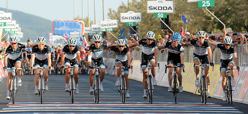
I don't think anyone who watched today's stage, ridden as a tribute to rider Wouter Weylandt who died after crashing on yesterday's stage of the race, will forget it. The teams provided a fitting tribute to the fallen rider, and Eurosport's David Harmon and Sean Kelly provided an honest, moving, and respectful commentary on events.

Tyler Farrar - Giro d'Italia, stage 4

(photo from Team Slipstream's Flickr)

On the run in to the line, as Tyler Farrar, a close friend of Weylandt, moved backwards to allow Weylandt's Leopard-Trek team mates to cross the line together, a Leopard rider (Stamsnijder, I think), beckoned Farrar forward to join them, and they crossed the line as one. It was an astonishingly moving moment, and one that honoured the sport, and the memory of Weylandt.

The fans played their part too, lining the route, and displaying Weylandt's race number, "108", as well as banners paying tribute to him.

The prize money from today's stage is to be donated to Weylandt's family.

There are better reports of today's stage elsewhere - but I wanted to personally mark the day as one where the teams, riders, race organisers and fans did the right thing - and thank them all for doing our sport, and Weylandt's memory, the honour they did it today.

Chapeau, and RIP Wouter Weylandt.

Posted via email from monkeyphoto's posterous

Tuesday, May 3, 2011

#30DaysofBiking The Last Words (This Year)

29042011292
From the Bridge on the Wheelock Rail Trail

Like a silly monkey, I did my last update on 30 Days of Biking with a scant two days of riding to go, so this may be a short update.

The 29th was a public holiday here in the UK, because of the wedding of Prince William, and Kate Middleton. I understand that it was a small affair, but you may have heard about it.

Whilst I don't wish the happy couple ill, I was uninterested in the event, and had resolved to ride in the morning, as the other members of the Monkey household had determined to make the Royal Wedding their focus. (It was still on when I got back - and 20 minutes of Philip Schofield desperately filling while very little happened convinced me I'd made the right decision).

I decided to take the Surly Long Haul Trucker as far as I could go on NCN5, the Cheshire part of which runs from Kidsgrove to Chester (51 miles or so). The Surly was the choice because I didn't know what the terrain would be like, and short of quicksand / lakes of fire, it can handle anything.

29042011293

Another Bridge, this time in Middlewich

From Crewe, the easiest way to join up with NCN5 is to head for the Wheelock Rail trail (or if you're going by road, Sandbach station - turn right from the station entrance, and then right again at the industrial estate). Signage for this route is lacking at points, and sadly that turn is one of them - I'd strongly suggest printing, and taking along the map.

With that bit of route finding sorted out, it's a very pleasant ride up to Middlewich, on rural roads that are mostly rolling or flat, and there's enough signage for this portion to keep you on the route (I did have the map on my bar bag to be sure though).

At Middlewich, a missing sign meant a mile or so of detour. Once I'd found my way again, there was an odd portion that appeared to direct me down a road, but actually points on to a restricted byway. From the byway, one should join the canal towpath. Unfortunately, that part of the route was blocked, due to some maintenance work being carried out.

I had a quick bimble 'round at the other end of the byway to see whether I could pick up the route again, but had no such luck. Rather than chance the A roads that seemed to link to the next part of the route, I decided to retrace my steps and pick up the eastern end of NCN5 instead.

29042011295
Foden Business Park

Heading back, I noticed this place (Foden Business Park) which, having fallen on hard times, seems to have become a dumping ground. It was a rare intrusion into the predominantly rural atmosphere of this ride.

29042011296

I only had 10 miles or so to go at this point though

Once through Sandbach and Hassall Green, it's canal towpath that forms the bulk of the Church Lawton - Kidsgrove section of NCN5. It's a nice enough ride, but has to be taken easily because of folk out and about taking the air. The morning was heating up nicely by now too, so it wasn't too much of a hardship to ride at an easy pace.

29042011297

Another Cobbled Climb at the Locks

There's still the cobbles, of course - and some "interesting" interactions with bridges (very low headroom, narrow paths &c).

In all, I racked up 40 miles at a pottering sort of pace - lovely ride, and I'm already looking for a viable route past that blocked towpath.

Saturday was the last day of the challenge, and I rode errands that day, taking the Brompton to buy paint for our back gate. An ordinary 5 miles or so in lovely weather. The Brompton has been receiving a bit of TLC over the weekend, as this tough little bike has been shamefully neglected in the last couple of years. The winter rides have done it no favours at all, and a new chain and cassette will be needed before next winter. For the time being, touching up the scratches, and replacing the frame protectors (Bromptons have a surprising number of cable rub points) will have to do.

So that's it for another year - we were blessed with some lovely weather this time around, and I was able to tick off some of the routes and "wonder where that goes" roads I'd had in mind for a while. Over the course of the challenge, I missed 3 days of riding - two due to family commitments, and one due to laziness, naughty dogs and the Tour of Flanders. I was determined not to do the "pedal the Brompton around the block" cop out that I occasionally resorted to last year.

As ever, the bulk of my rides were commutes or quotidian trips to the shops, with only a few at the weekend being notable for distance or speed. Whilst it can occasionally require inspiration to ride every single day, commuting and running errands takes none at all - why not give it a try?

Posted via email from monkeyphoto's posterous

Yehuda's Natural Home

03052011303
I wrote a little while ago about my Yehuda Moon and the Kickstand Cyclery patch.

Finally got around to sewing it on to my Carradice last night - it's not central, and that will bug me, I think, but surely Yehuda's natural home is on a Carradice bag.

Did I sew it on myself?

No, I sewed it on to the bag, like I said.

Posted via email from monkeyphoto's posterous

Thursday, April 28, 2011

More Words on #30Daysofbiking, The Best of Times, the Worst of Times.

19042011277
A sunny commute, last week.

I'd intended to write this at the end of last week, the third full week of #30daysofbiking,

It turned out that we were rather busier than I'd anticipated over the weekend (in a good way), so it's being written now, part way through the fourth full week of the challenge.

Last week was a particularly pleasant time to be out and about by bicycle. The weather was glorious, and the 15°C threshold for knee friendly shorts wearing was reached on several days (although still not at the time I set off from home). Commutes were mostly uneventful, with light half term traffic contributing to a general feeling that things weren't so bad after all out here.

22042011278
Bluebells

On Friday, I took a quick ride out on the rougher part of the Cheshire Cycleway near to home.

22042011280
The Bridlepath forming part of NCN 70

The ride up is on road, and then there's a stretch of gravelly, holed bridleway. It's interesting to ride for someone used to tarmac, and I discovered fairly quickly that I don't ride it particularly well.

22042011282

Just over the bridge you can see in the distance on the pic above. The LHT is a heavy bike, but it should be ok...

My speed topped out at around 13mph on the gravel, and I wandered a bit on it, torn between trying to make the bike hold a line, and trying to stay on the bike full stop! Riding the crown of the road doesn't work here because of the strips of grass down the centre.

22042011283

Cherry Tree & NCN70 Signs

Once off the bridlepath, it's back onto tarmac again, and as the sun warmed my limbs, the blossom trees along the route created an odd, snowstorm like flurry to ride through. Rather than retrace my steps, I rode on through the blossom to the main road, and then home. It was a short ride, but really enjoyable.

On Sunday, after returning from my sister's 18th birthday party (Happy Birthday Sis!) I took the opportunity for another quick ride, this time on the SCR2.

24042011287
Another Lovely Day to be Out

This time, I rode one of the back road routes up to Sandbach - another old route of mine that's a quick 16 mile or so loop.

24042011289

Granted, it's no Kapelmuur, but this Church is on a Hill.

There's a couple of nice hills on this route, and a decent loop bit at the end that allows you to retrace your steps.

No ride on Monday, (Happy Birthday Son!) but Tuesday meant that commuting resumed.

27042011290
Another Bridleway, this time part of the commute home.

The half term traffic is still (not) there, and the roads are still pretty quiet, but I've had a couple of nasty run ins with drivers over as many days.

The first was a Cravendale logo'ed truck, that stopped at the same lights on the roundabout I was waiting at, about 6 inches from the bike and I. Now if you know anything about trucks and bikes, you'd be pretty worried by that. The driver gesticulated, well, something, in his mirror, I guess at me, and then roared off at speed up the exit to Crewe station...where he had to stop at the pedestrian crossing anyway. A pointless move from a "professional" driver. (The lane next to the one he and I were "sharing" at the lights was empty, or, god forbid, he could have waited behind me and overtaken safely).

Anyway, can you guess whether I'll be buying any Cravendale product in future?

27042011291
Oh Shit.

As if to prove that that was not my day, I managed to hit a load of debris in the bike lane just after the Handforth Roundabout, and ended up with this (see pic) in my tyre, and a rather less obvious thorn. Then my spare tube was punctured, so a roadside puncture repair was my only option (thankyou, Rema, for your nifty TT02 kit). That done, I rode on, only to find that the less obvious thorn had caused a slow puncture (impossible to find by eye). It soon became clear that I needed to stop every mile or so to top up the tyre, making the ride home somewhat tiresome.

My last morning commute of the week was enlivened by another truck driver (no company logo) who took exception to my moving out to stop him trying to squeeze past me (he'd have overtaken into the path of a coach that I'd seen, and he, evidently had not, no less). An angry hoot, and a stupidly close overtake followed (again, with a now completely empty lane alongside that he could have used to overtake safely). I'd estimate he waited an extra half second, if that, to pass, and for this, he was entirely willing to risk killing me. It's dispiriting when car drivers indulge in this sort of petulant attempted murder, but when people who drive for a living do it, it's hard not to lose hope entirely.

Posted via email from monkeyphoto's posterous